A brand and visual style that embodies the notion of strength through partnership.
A collaboration between bp, National Grid, Equinor, Shell, Total and ENI - NEP came to us as a small team in their formative stages, with a requirement for a sharp and professiona brand identity that illustrates a theme, along with supporting assets.
Northern Endurance Partnership logo

Primary logo

Northern Endurance Partnership brand guide cover over a frosted texture
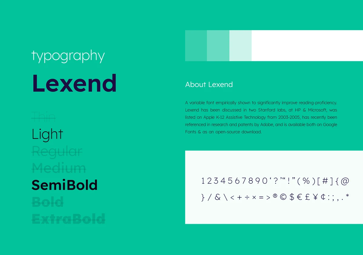
Brand guide page: typography in Lexend with a mint green panel
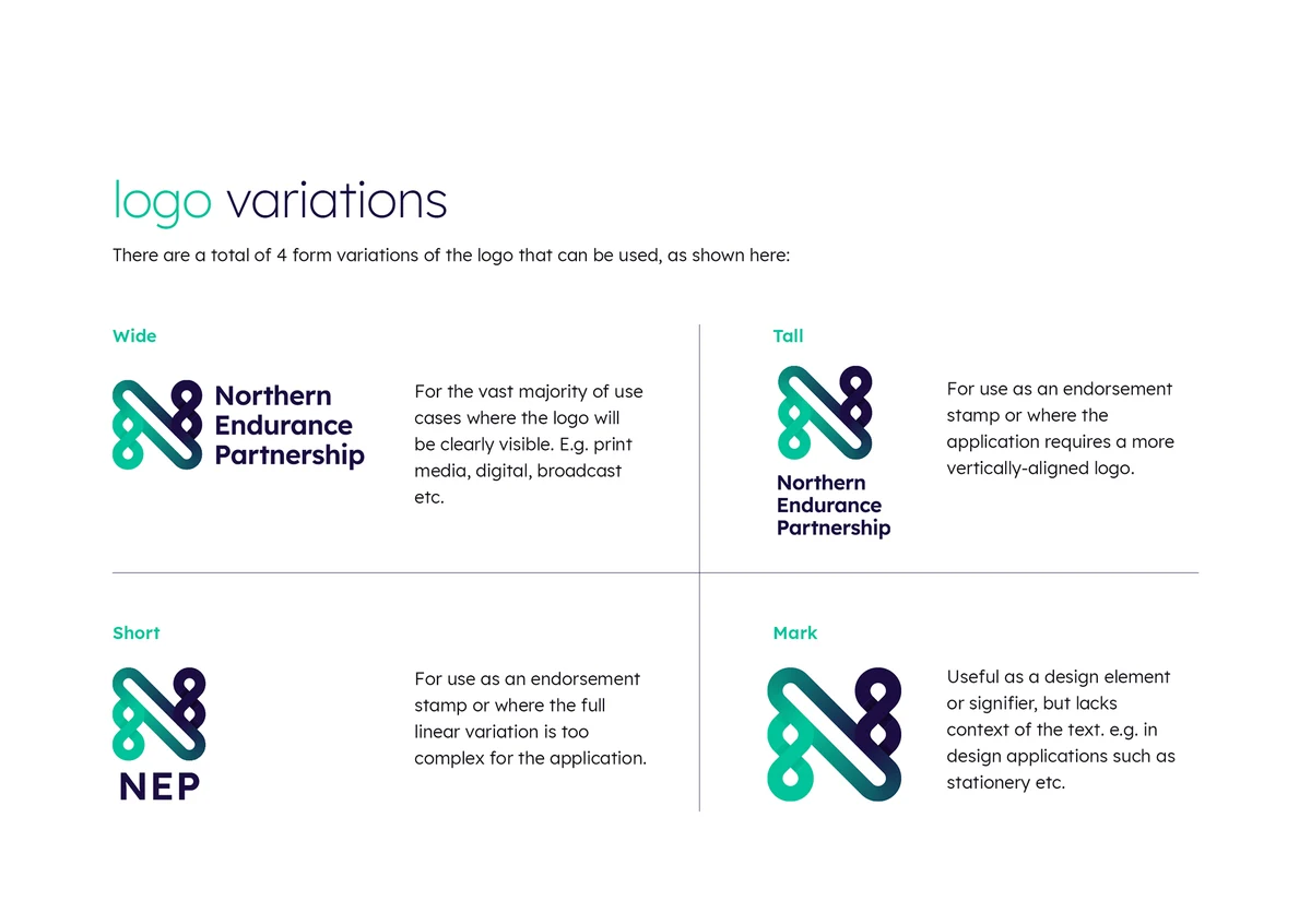
Brand guide page: logo variations (full, stacked, short and mark)
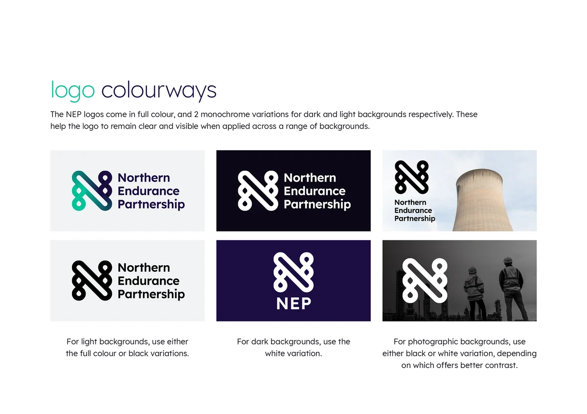
Brand guide page: logo colourways on light, dark and photographic backgrounds
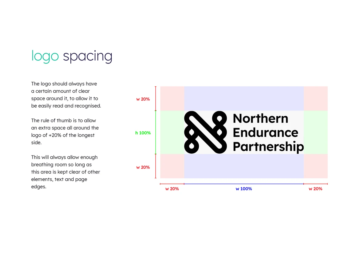
Brand guide page: logo spacing rules
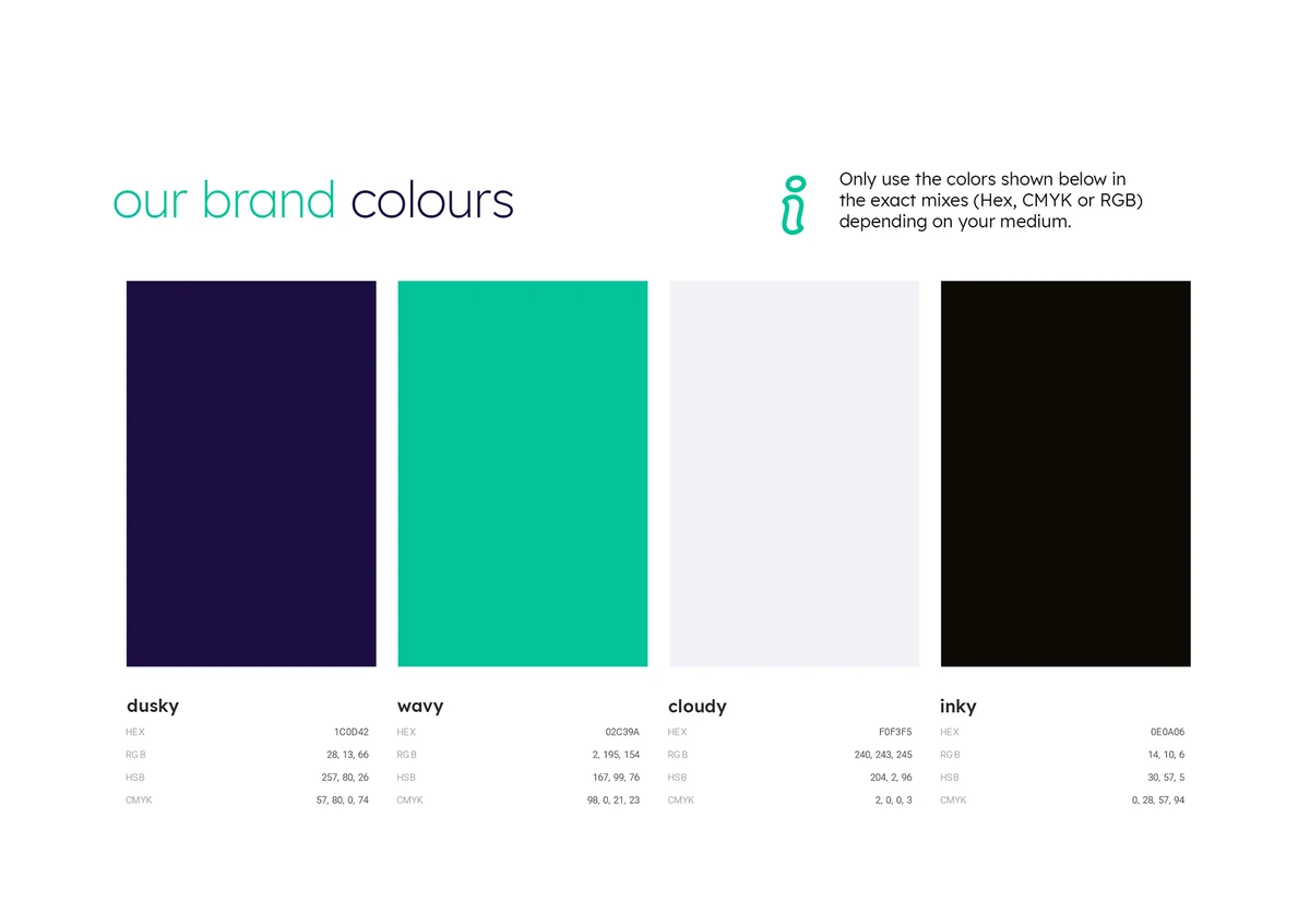
Brand guide page: brand colours (dusk, ivory, cloudy and inky)
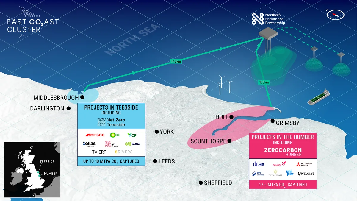
Illustrated map of the East Coast Cluster showing projects along the Humber and Teesside coast
↑Back to Top